How to Choose Color Temperature for Facade Lighting?

Time:2026-09-22 Author:Sophia
0%

Facade lighting changes how a building feels after sunset. It can reveal texture, soften hard edges, or make a welcoming entrance appear cold. The selected color temperature influences these impressions more than many project teams expect. Warm light, usually between 2200K and 3000K, can complement brick, timber, and sandstone. Neutral white, often between 3500K and 4100K, supports contemporary façades and clearer surface detail. Cooler light may suit glass or metallic structures, but it can feel severe when overused.

There is no perfect setting.

Learning how to choose the right color temperature for architectural facade lighting requires more than reading a Kelvin chart. Experienced designers consider the façade material, surrounding streetscape, viewing distance, landscaping, and nearby interior lighting. A limestone wall may glow under warm light, while the same setting can flatten a blue-gray concrete surface. The fixture’s color rendering, beam angle, mounting height, and dimming capability also affect the result. Small differences become obvious across a long elevation.

I have seen mockups change a decision.

A trial installation often reveals glare, unwanted shadows, or uneven brightness that drawings cannot show. Weather matters too. Wet pavement reflects light and can make a façade appear brighter than expected. Local lighting requirements and nearby residents should guide the final plan. Reliable specifications should state measured output, color consistency, control settings, and maintenance expectations. Still, even careful recommendations deserve review. A visually attractive sample may not perform well across every season or viewing angle. This guide examines practical methods for selecting a balanced, durable, and context-sensitive color temperature.
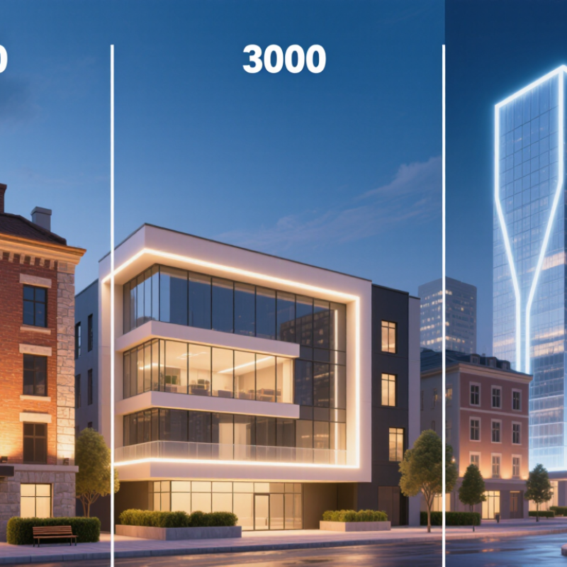
How to Choose Color Temperature for Facade Lighting?

Understanding Color Temperature and Its Role in Facade Lighting

Color temperature describes the visible warmth or coolness of facade light. It is measured in kelvins, or K. Lower values appear warmer, while higher values look bluer. CIE 015:2018 defines correlated color temperature as a practical description for light sources near a blackbody curve.

A warm 2700K–3000K source can soften brick, sandstone, and historic surfaces. It may also reduce visual glare in residential streets. Neutral 3500K–4000K light can reveal concrete edges and metal details more clearly. Cooler light above 5000K often feels sharper, but it can make stone appear grey and uncomfortable. I once assumed brighter, cooler light improved architectural detail. That assumption was wrong.

Color temperature alone does not predict facade quality. The IES TM-30-20 method evaluates color performance with 99 color samples, far beyond the eight samples used by traditional CRI. Check fidelity, gamut, beam angle, and surface reflectance together. A warm lamp with weak red rendering may flatten terracotta. A neutral lamp with excessive blue energy may dominate nearby windows. The U.S. Department of Energy’s Solid-State Lighting research reports also emphasize spectral quality, glare control, and application conditions, rather than relying on one metric. Field testing remains essential. View the facade at dusk, after dark, and from neighboring properties. The result may still need adjustment.

Assessing Building Style, Materials, and Architectural Details

Choosing facade color temperature starts with the building’s architectural language, not a fixture catalogue. In my lighting assessments, I read the facade at dusk before measuring illuminance. A classical stone building often benefits from warm white light, around 2700K to 3000K. It can reveal columns, cornices, and carved edges without making the stone appear gray. Modern concrete, glass, and metal may accept 3500K to 4000K. Yet cooler light can feel harsh on exposed concrete. Context changes the answer.

Material response deserves a close site review. Pale limestone reflects light strongly, so lower output may preserve texture and reduce glare. Dark brick absorbs more light and needs careful aiming, not simply higher brightness. Glossy panels can create bright patches when viewed from the street. I check samples under the proposed temperature whenever possible. Small tests matter. A red brick wall may turn muddy under excessive cool light, while timber can lose its natural warmth. These effects are easy to miss in drawings.

Architectural details should guide contrast and beam placement. Recessed windows, balconies, and deep joints need controlled shadows to retain depth. Uniform lighting can flatten a facade, even when technical readings look acceptable. I also compare the building with nearby streets, trees, and signs, because visual comfort depends on the whole view. My first proposal is rarely perfect. Weather, surrounding light, and viewing distance can expose weaknesses later. A short night trial, reviewed from several angles, is a dependable way to refine the temperature before permanent installation.

Matching Color Temperature to Function, Mood, and Surroundings

Facade lighting should support the building’s purpose before it seeks attention. A warm 2700K to 3000K tone often suits homes, hotels, and historic masonry. It reveals brick, timber, and cream stone with a calm evening character. Cooler 3500K to 4000K light can clarify entrances, offices, and civic buildings. It feels alert and precise. Material changes the result.

Function sets the baseline, while mood shapes the visitor’s response. A restaurant entrance may need warm light for welcome, with slightly brighter illumination near steps. An office facade may use neutral white light to support orientation and security. Keep contrast controlled. Strongly lit walls beside dark streets can create glare and visual discomfort. Check nearby windows, trees, road surfaces, and neighboring properties before final selection. A nighttime mock-up is more reliable than a daytime sample.

Experienced lighting teams measure the facade after installation, not only before it. They compare color appearance, shadow softness, and reflections from glass. Consistent fixtures matter, because mixed temperatures can make one elevation feel accidental. Still, no formula works perfectly. I once preferred a neutral tone for pale stone, but the completed scene felt cold beside mature trees. The warmer setting worked better, though it reduced crisp detail. Record that trade-off and adjust levels for comfort, legibility, and respect for the surrounding nightscape.

Balancing Visual Comfort, Energy Use, and Local Light Regulations

Choosing facade lighting starts with how people experience the building, not with a color temperature chart. In site reviews, I have found that 2700K to 3000K often creates a calm, welcoming appearance for stone, brick, and residential streets. Cooler light can sharpen glass and metal, but it may feel harsh near homes. It can also increase perceived glare.

Visual comfort depends on more than Kelvin values. Shielded fixtures, accurate aiming, and controlled brightness matter just as much. A warm lamp can still disturb residents when it shines into bedroom windows. Walk the site after dark. Check the view from sidewalks, nearby apartments, and passing roads. Small changes in aiming often solve more problems than changing the lamp.

Energy use deserves equal attention. Higher color temperatures do not automatically consume more power, but excessive brightness wastes energy. Dimming schedules, occupancy controls, and carefully spaced fixtures can reduce operation time. Local regulations may address glare, upward light, curfews, color limits, or protected night environments. Confirm the current municipal requirements before final design approval. Written guidance can be incomplete, and interpretations may differ between districts. I once preferred a cooler setting for clearer architectural detail, but the surrounding homes made that choice uncomfortable. The better decision was less dramatic and more respectful. Test sample sections on site, record brightness levels, and invite feedback before installing the full facade.

Testing and Adjusting Facade Lighting Before Final Installation

Choosing a facade lighting color temperature should begin with a real site test, not a catalog image. Warm light around 2700K to 3000K often suits stone, brick, and residential buildings. Cooler light can sharpen glass, metal, and modern architectural lines. The surrounding street lighting also affects the result.

Install temporary fixtures at the planned mounting height before final work begins. Test them after sunset, when shadows and neighboring lights become visible. Walk around the property from several viewpoints. Check the entrance, upper walls, windows, and nearby sidewalks. A wall may look balanced from the driveway but appear harsh across the street. Small differences matter.

Record each test using the same camera settings, although photographs cannot replace direct observation. Compare two or three temperatures on the same facade section. Adjust beam angle, brightness, and fixture position before changing the entire scheme. I once selected a cooler tone for clean visual definition, but it made pale stone look gray and unwelcoming. That mistake changed the final decision. Do not ignore glare, dark patches, or light entering windows. These issues can affect comfort and local compliance. A qualified lighting professional should review electrical safety, mounting conditions, and applicable regulations before permanent installation. Test again on a cloudy evening if possible. Weather changes the facade’s apparent color.

FAQS

What does color temperature mean in facade lighting?

It describes whether light looks warm or cool. Lower Kelvin values appear warmer. Higher values look bluer.

Which color temperature suits brick, sandstone, and historic surfaces?

Warm light around 2700K–3000K often softens brick, sandstone, and older surfaces. It can also reduce glare on residential streets. Results still vary.

When is neutral light more useful?

Neutral light around 3500K–4000K can reveal concrete edges and metal details clearly. It works well for many modern facades. Not always.

Why can very cool light create problems?

Light above 5000K may sharpen glass and metal lines. However, it can make stone appear grey and uncomfortable. I once expected cooler light to improve every detail. That judgment was wrong.

Is color temperature alone enough to choose facade lighting?

No. Consider color rendering, gamut, beam angle, and surface reflectance together. A warm lamp with weak red rendering may flatten terracotta. One number cannot describe everything.

How should facade lighting be tested before permanent installation?

Use temporary fixtures at the planned mounting height. Test them after sunset. Compare two or three temperatures on the same wall section. Catalog images are not enough.

Which viewpoints should be checked during a lighting test?

Walk around the property and inspect the entrance, upper walls, windows, and sidewalks. View the facade from across the street too. A driveway view can hide harsh glare.

What adjustments should be made before changing the entire lighting plan?

Adjust beam angle, brightness, and fixture position first. Check dark patches and light entering windows. Small changes can matter.

Can photographs accurately judge facade lighting?

Photographs help compare tests when camera settings remain consistent. They cannot replace direct observation. Your eyes notice comfort differently.

Why should testing continue in different weather conditions?

Test again on a cloudy evening if possible. Weather changes the facade’s apparent color and shadow pattern. The final result may still need adjustment.

Conclusion

Choosing the right color temperature is essential for creating attractive, functional, and context-appropriate facade lighting. To understand how to choose the right color temperature for architectural facade lighting, begin by considering the building’s style, materials, colors, and architectural details. Warm white light can enhance traditional surfaces, natural stone, and welcoming environments, while neutral or cooler white tones may emphasize modern lines, glass, metal, and clean geometric forms. The surrounding streetscape, landscape, and neighboring buildings should also influence the decision.

The selected color temperature should support the facade’s purpose and desired atmosphere without causing glare or visual discomfort. Designers should balance brightness and color with energy efficiency, nearby residents, pedestrian experience, and applicable local lighting regulations. Before final installation, testing different color temperatures at night can reveal how the light interacts with textures, shadows, and surrounding conditions. Small adjustments to the fixtures, angles, brightness, and color temperature can help achieve a cohesive result that highlights architectural character while remaining comfortable, efficient, and respectful of its environment.

Sophia

Sophia

Sophia is a dedicated marketing professional with an exceptional depth of knowledge about her company's products and services. With a keen understanding of market trends and customer needs, she crafts insightful blog posts that not only inform but also engage readers, enriching the company’s online......